![[team] image of individual team member](https://cdn.prod.website-files.com/688b9046c3a16332031266b4/688cd808482d26fd018652e8_portfolio-3a.png)
Mobile Transformation
2023
My Role: Lead Designer, UI Component Creator
Team: Design Manager + 1 Designer
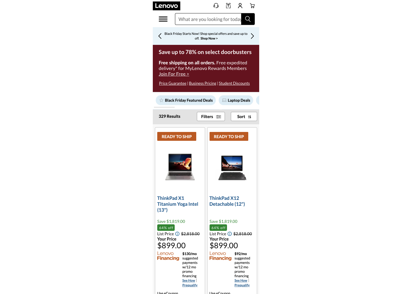
Redesigning mobile sales page
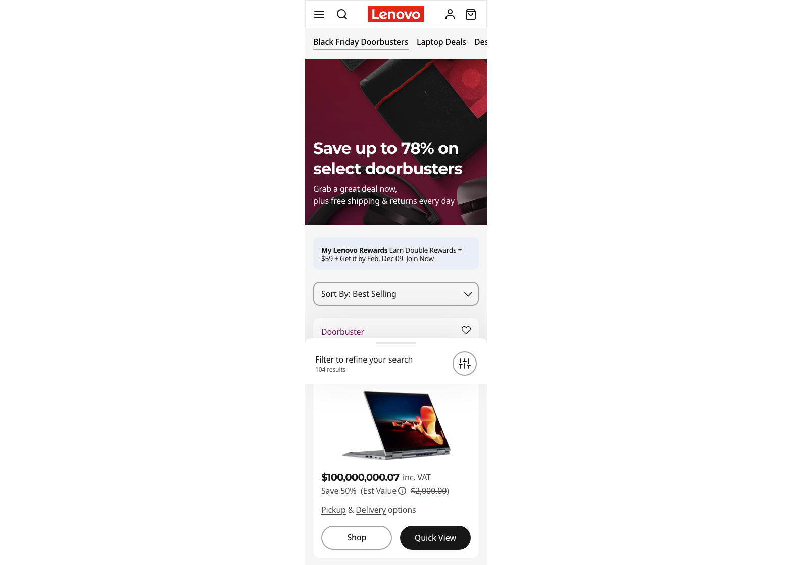
Updated Mobile Experience
Updates needed on the sales page
Easy to read
The side by side product card style wasn't as helpful to the user as initially tested because it added too much height to the card making it difficult to read.
Hiearchy of Information
With all the content displayed on a product card, it was difficult for the user to digest all the information.
Accessibility
Many colors did not pass AA or AAA accessibility for web standards. Also, there were frequent clickable areas were too small for a user to touch without accidentally touching another element on the page.
Micro Interactions
In order to keep the user engaged on our site, we wanted to add micro interactions to help guide our users through their search and different tasks.
![[digital project]](https://cdn.prod.website-files.com/688b9046c3a16332031266b4/68925664196c924a2d61c3d8_DLP-Exp%20A-1.png)
![[digital project]](https://cdn.prod.website-files.com/688b9046c3a16332031266b4/68939e1bf95e33c7d0b9c72e_Moble-Transformation-DLP%20%E2%80%93%20Final%20%E2%80%93%2011-b.png)
Updated user-centered design for our high-traffic sales pages
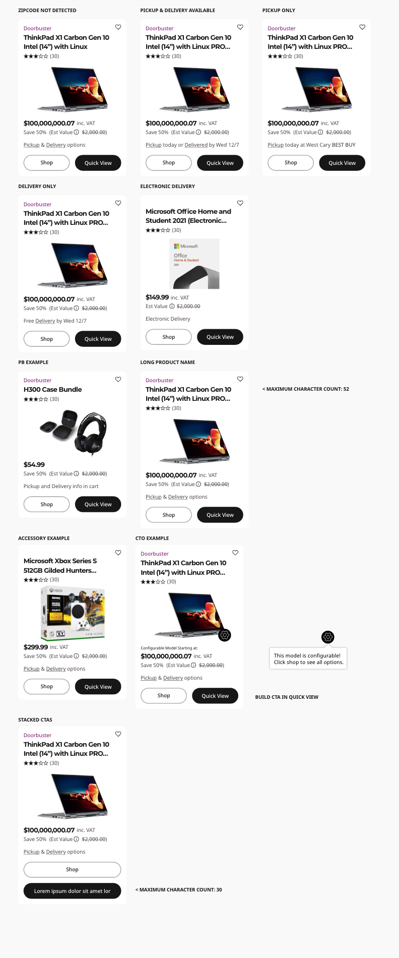
The elements created were single model product cards including the creation of the quick view functionality in order to keep our product cards simple and give the user access to additional information as needed.
Ensured all touch targets on mobile designs were at least 7mm x 7mm and 2mm apart (Baymard UX Research). All colors were updated to AA and AAA for any call-to-action areas.
Mobile Transformation Sales Page
Easy to Read
Consolidated content on the product card for the initial page load made it easy for the user to see what product they were looking at and how much it was on sale for.
Hierarchy of Information
The user can easily see more information by clicking on the card or the "Quick View" button. This allows them to digest content in smaller bits.
Micro Interactions
Quick view and filter drawers swiping up from the bottom gave the user interesting interactions while letting them know they have not left the page. The icons also delightfully rotate when dropdowns open up.
Project Gallery
Click on images to expand
Checkout Next Project
![[digital project] image of a graphic design on a screen (for a web design agency)](https://cdn.prod.website-files.com/688b9046c3a16332031266b4/688cda12c65837aab6994ff9_portfolio-4.png)
Designing a personalized homepage for members
A deep dive into a recent personalization and AI integration ux project, highlighting research, process, and iteration design.
![[interface] image of a mobile device with a website loading on it (for a ai legal tech company)](https://cdn.prod.website-files.com/688b9046c3a16332031266b4/688cdcfebff9e52d950a3d12_Screenshot%202025-07-22%20at%202.40.14%E2%80%AFPM.png)
The Evolution of Trackpoint
Explore a six year journey through Sketch, Adobe XD
and finally Figma to create a single source of truth for
building designs for Lenovo.com